Do you remember the days when viewing the internet required dial-up internet and a desktop display the size of your microwave?
These days, we use desktop computers, laptops, tablets, etc. We own a variety of these gadgets, and we expect pleasant web experiences on each one. Especially on mobile.
In fact, web design statistics show that by 2025, nearly 75% of all internet traffic will come from mobile devices.
Currently, mobile devices account for about 50% of all internet traffic.
Businesses that continue to operate websites that are not optimized for the bulk of their traffic face substantial consequences.
Your website needs to be available from any device if you want to be successful in the market. How? Responsive web design
What is a responsive web design?
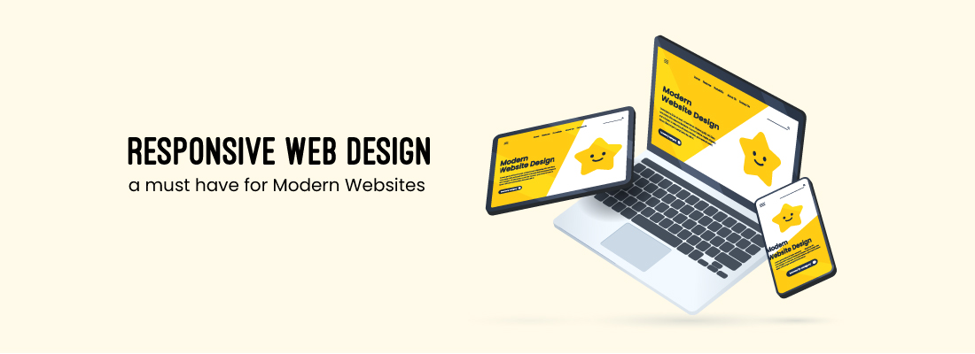
A responsive web design is a method to create websites that guarantees that the site’s layout and content are positioned correctly and are easy to read and browse on all devices, including desktop computers, tablet devices, and mobile phones.
Making a single website that can adapt to various screen sizes, resolutions, and orientations is the goal of responsive web design.
Cascading style sheets (CSS), adaptable layouts, and pictures that can adapt to the size and kind of screen are used to achieve this.
In other words, a responsive website will adjust its content to fit the screen size of the device being used to see it.
By doing this, the website is made user-friendly and accessible on a variety of devices and screen sizes, resulting in a seamless and consistent user experience.

What three elements make up responsive web design?
The following are the three elements of responsive web design:
- Flexible grid systems that can adjust to the size of the screen of the device being used to view the website are referred to as flexible layouts. Based on the available screen space, a flexible layout will change the size and location of content components like text, images, and menus.
- Flexible Images and Media: This includes the use of pictures and media that can adjust to the screen dimension of the gadget being used. This is accomplished by utilizing responsive image and media strategies, such as presenting various pictures depending on the resolution of the device or using CSS to scale photos and videos.
- Media Queries: These are CSS rules when it comes to different styles to a site based on the device’s display size and orientation. To ensure that the website is optimized for each device type, designers might use media queries to generate distinct styles for various devices. For smaller displays, a media query might alter a website’s font size, line height, or column width.
Responsive web design vs Adaptive web design
Let’s now look into the distinction between responsive web design and adaptive design.
Well, the distinction between them is that the responsive web design can adjust the rendering of a single-page version.
On the other hand, adaptive design often produces numerous totally original iterations of the same page.
Despite the fact that they are both regarded as crucial web design trends that give website owners control over how their site appears on many different displays, their methods are entirely different.
So, with responsive web design, users have access to the same basic document via their browser, despite the gadget, but CSS code tends to regulate the layout and render it differently based on screen size.
Also, with adaptive design, a script will determine the screen size before accessing the template created for that device.
Responsive Web Design Examples
We’ve compiled a collection of responsive web design examples for you to look at in order to clarify the concept and inspire ideas for your own company’s website:
KlientBoost
Apart from the fact of having a rocket ship on your webpage is great, KlientBoost’s responsive design works well on all gadgets.
You’ll notice that the menu has become compressed into a drop-down list on smaller devices, and the main image becomes adequately cropped.
The Boston Globe
Outlets have had to adjust to these shifts as traditional media has transitioned to the digital age.
The Boston Globe is a prime example, and responsive web design is a crucial component in ensuring that their viewers can access news on all platforms.
The key adjustment is the reduction of columns from three to two to one, depending on the size of the screen.
This enables their audience to enjoy an uninterrupted feed.
Change.org
Anyone can create and sign petitions on the website Change.org to change the world.
It’s interesting to note how the format of the highlighted stories changes significantly from device to device, yet the backdrop image of the world map remains uncropped.
This responsive design is optimized for mobile users by allowing vertical scrolling, unlike desktop devices where users scroll horizontally to navigate through stories.
How can a website’s responsiveness be verified?

Testing the attentiveness of a website is a simple and substantial part.
You can check the responsiveness of the webpage just by launching it in the browser and just dragging the edges of your browser to emulate different windows.
If the content begins to shrink seamlessly and keeps looking good as it becomes smaller, possibilities are you have a mobile web design that is responsive.
Use the built-in developer tools in your browser to verify the website’s responsiveness and to solve any problems you have with it on various screen sizes.
Frequently Asked Questions
How can I optimize images for responsive design?
You can optimize pictures for responsive design by using image compression methods, specifying image sizes in the HTML, and using CSS to adjust the image size and position.
How does responsive web design impact SEO?
Responsive web design can positively influence SEO by enhancing the website’s mobile-friendliness, which is a ranking factor for Google.
A responsive design means that the website is accessible on all gadgets, leading to better user experience and higher engagement, which can indirectly enhance search engine rankings
Conclusion
The market is changing today and so has the goods.
In a race to entice more and more clients, engineering technicians and scientists are coming up with a huge variety of variations in the goods or services and continuously improving the ones that already exist.
This has flooded the market with portable devices which are so comparable yet so different, rendering it more difficult for designers to develop responsive websites.
It is impossible to produce an edition for each device of a specific size hence we go with the responsiveness of the gadget.
This responsive design tutorial has addressed every area of responsiveness which can help construct responsive websites.
So if you have a requirement for responsive web design get in touch with Yugasa Software Labs.
Read More: ALL ABOUT RESPONSIVE WEB DESIGNS AND WHY IS IT REQUIRED


